Law firm websites across Australia are quietly losing prospective clients before a single conversation takes place.
Mobile devices now account for over 63% of all global web visits, with users accessing websites from their phones more than three times as often as from desktop computers IBISWorld, and Google's mobile-first indexing has been universal since July 2024, meaning every law firm website is now evaluated primarily through a smartphone lens.

A poor mobile experience is no longer just a user inconvenience. It is a direct and measurable threat to search visibility, lead conversion, and firm reputation. As law firm marketing specialists, this is one of the most consistent performance gaps we identify across Australian legal practices, from boutique family law firms to mid-sized commercial practices. This post breaks down the seven most common mobile UX failures on legal websites and provides a prioritised, actionable fix plan for firm principals and practice managers who want to turn their website into their best-performing client acquisition asset.
Why Mobile UX Is Now a Business-Critical Issue for Law Firms?
What Does Google's Mobile-First Indexing Mean for Your Firm?
Mobile-first indexing is Google's practice of using the mobile version of your website as the primary basis for ranking and indexing across all search results, on all devices. Google confirmed the completion of this transition in mid-2024, announcing that all remaining desktop-crawled sites would be indexed exclusively by the Googlebot Smartphone crawler after July 5, 2024. For Australian law firms, this means there is no longer a distinction between "mobile SEO" and "SEO." Google is assessing your site exactly as a prospective client would on their iPhone or Android phone. If your mobile version is slow, hard to navigate, or difficult to read, your search rankings will reflect that, regardless of how authoritative and polished your desktop experience might be. A firm investing in content for its law firm website, paid search campaigns, or Google Business Profile optimisation is undermining all of that investment if the underlying mobile experience fails to convert visitors into inquiries.
How Much Are Mobile UX Failures Actually Costing You in Lost Clients?
The revenue cost of a poor mobile experience is not theoretical. Research consistently shows that a one-second delay in mobile page load times can cause conversion rates to fall by up to 20%, and for professional service firms where a single new client matter can be worth tens of thousands of dollars, the arithmetic compounds quickly. This is compounded further by behavioural data showing that 88% of online consumers report they are less likely to return to a site after a bad experience. For law firms, where trust and first impressions are everything, a frustrating mobile visit rarely gets a second chance. The client who could not complete your contact form, could not find your practice areas, or gave up waiting for your page to load is not sitting patiently. They are already on a competitor's site.
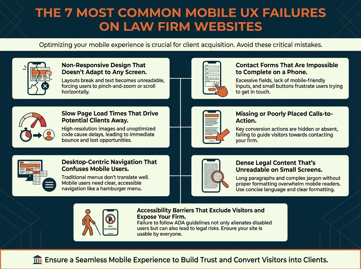
The 7 Most Common Mobile UX Failures on Law Firm Websites
1. Non-Responsive Design That Doesn't Adapt to Any Screen
Many law firm websites were originally built for desktop audiences and never properly adapted for smaller screens. Content fails to reflow intelligently, text requires zooming to read, images bleed beyond the viewport, and elements overlap in ways that make navigation genuinely impossible. This is the most foundational mobile UX failure, and without addressing it, no other optimisation effort will hold up under real-world usage. A prospective client who must pinch, zoom, and scroll sideways to read your practice area description is gone within seconds, and they will not be back. Responsive design is not a feature or a nice-to-have at this stage of the web's evolution. It is the baseline requirement for any professional service firm operating in a competitive market.
2. Slow Page Load Times That Drive Potential Clients Away
Uncompressed image files are among the most common culprits behind slow law firm websites, particularly oversized attorney headshots and hero banners that have never been optimised for mobile delivery. Excessive third-party scripts, poor hosting environments, and unminified code compound the problem. If a page takes longer than 3 seconds to load, 53% of mobile visitors will abandon it entirely Statista, and Google's Core Web Vitals framework specifies that the Largest Contentful Paint (LCP) should occur within 2.5 seconds to achieve a passing score. Law firms whose sites fail this threshold face a compounding disadvantage: users leave before converting, and Google's algorithm penalises the site with lower rankings, reducing the volume of new visitors before they even have the chance to be frustrated.
3. Desktop-Centric Navigation That Confuses Mobile Users
Navigation menus built for hover-based desktop interactions do not translate to touchscreens. When law firm sites present users with dense multi-level dropdowns, small tappable links clustered close together, or navigation bars that occupy the entire visible screen on a small device, mobile users experience genuine confusion. Research from Baymard Institute confirms that 66% of mobile sites place tappable elements too close to each other, and 32% have touch targets that are simply too small for reliable navigation FSET Inc.. A prospective client who cannot easily locate your practice areas or find a way to make contact within the first few seconds of arriving on your site will not persevere. They will navigate to a firm whose website is built for the way people actually browse.
4. Contact Forms That Are Impossible to Complete on a Phone
Contact forms are the primary conversion mechanism on most law firm websites, yet many are functionally broken on mobile. Too many required fields, tiny input areas without persistent labels, date pickers that do not respond to touch, and single-column desktop layouts that do not reflow to fit smaller screens all contribute to abandonment rates that law firms rarely measure but consistently suffer from. Research shows that 81% of users abandon online forms after starting them, but reducing the number of fields to five or fewer can significantly reverse that trend Priori Data. For a law firm whose entire lead pipeline depends on inquiry submissions, a poorly designed mobile form is the digital equivalent of a broken reception desk. Our post on beyond the contact form explores innovative ways to reimagine this part of the client journey entirely.
5. Missing or Poorly Placed Calls-to-Action
A mobile visitor who reaches the bottom of a practice area page without encountering a clear, accessible next step is almost certainly a lost lead. Many law firm sites bury their calls-to-action below the fold, use text-sized buttons that are difficult to tap accurately, or default to vague language like "Contact Us" that conveys no urgency and no specific outcome. 74% of users say they are more likely to return to a mobile-friendly site, yet the quality of CTA placement and design remains one of the most commonly overlooked conversion factors on professional service websites White Label IQ. On mobile, where decision-making is faster, more impulsive, and less patient than on desktop, a CTA must meet the visitor exactly where they are in their journey, immediately visible, easy to activate, and direct in its language.
6. Dense Legal Content That's Unreadable on Small Screens
Long, unbroken blocks of legal text are a readability challenge on desktop but a functional barrier on mobile. Small font sizes, low contrast ratios between text and background, and an absence of white space make content physically difficult to read on a smartphone screen. Mobile users scan rather than read linearly, which means well-structured content for a law firm website must use clear headings, short paragraphs, expandable accordion sections for detailed information, and consistent typographic hierarchy to signal what matters and guide the reader's eye. Firms that do not adapt their content formatting for mobile scanning behaviour consistently see high bounce rates on their most strategically important pages, the very practice area and about pages that should be converting visitors into consultations.
7. Accessibility Barriers That Exclude Visitors and Expose Your Firm
Accessibility is simultaneously a usability issue and a legal risk for Australian law firms. Under the Disability Discrimination Act 1992 (DDA), which has been interpreted to extend to digital accessibility, websites that fail to accommodate users with disabilities can be subject to formal complaints. On mobile specifically, the most common accessibility failures include insufficient touch target sizes, missing alt text on images and attorney headshots, poor colour contrast ratios, and lack of compatibility with iOS VoiceOver and Android TalkBack screen readers. Beyond compliance, WCAG 2.2-compliant design produces measurable usability improvements for all visitors, not only those with disabilities, making accessibility an investment with returns that extend across your entire mobile audience.
How to Fix Your Law Firm's Mobile Website: A Prioritised Action Plan
Priority 1 — Adopt Responsive, Mobile-First Design
Responsive, mobile-first design means building every page layout beginning with the smallest screen and scaling upward, not adapting a desktop site downward as an afterthought. Every element, including navigation menus, imagery, contact forms, and calls-to-action, must reflow fluidly across all device sizes and orientations without requiring user intervention. This is the non-negotiable foundation. Our approach to professional service firm websites begins here, with wireframes designed for mobile use first, before a single desktop layout is considered. Without this foundation, every content, SEO, or conversion optimisation effort built on top of it is structurally compromised.
Priority 2 — How Fast Should a Law Firm Website Load on Mobile?
The target is a Largest Contentful Paint under 2.5 seconds, as specified in Google's Core Web Vitals framework. Achieving this for law firm websites requires compressing and resizing all images, removing unnecessary third-party scripts, leveraging browser caching, and ensuring your hosting environment delivers fast server response times. Run your site through Google PageSpeed Insights on a monthly basis to identify and address specific bottlenecks before they compound. B2B websites that load in one second achieve conversion rates three times higher than sites that load in five seconds, and five times higher than sites that load in ten seconds TekRevol, and while law firm websites are not ecommerce platforms, the behavioural principle translates directly: speed is trust, and trust is conversion.
Priority 3 — Simplify Navigation for Touch-Based Visitors
Redesign your navigation with the thumb, not the cursor, as the primary input device. Implement a clean hamburger menu or a streamlined sticky navigation bar that surfaces only the most important sections: About, Practice Areas, Our Team, Insights, and Contact. All interactive elements must meet the WCAG 2.2 minimum touch target size of 44 by 44 pixels, with adequate spacing between links to prevent accidental taps. The goal is that any prospective client, on any device, at any level of digital comfort, should be able to find what they need within two taps of arriving on your homepage. Every extra tap beyond that is a measurable drop in conversion probability.
Priority 4 — Redesign Your Contact Form for Mobile Conversion
Reduce your contact form to the minimum viable fields: name, preferred contact method (phone or email), and a brief description of their matter. Use a single-column layout with large, clearly labelled input fields and real-time validation that guides users through errors in plain language rather than blocking them with generic red error states. Always include a prominently placed click-to-call button as an alternative pathway on every page, not only on the contact page. For many mobile visitors, especially those contacting a law firm during a stressful personal situation, tapping to call is faster, more natural, and psychologically lower-friction than completing a text form. Removing that friction from the calling pathway is one of the highest-return changes most law firm websites can make. For a deeper look at reimagining this entire experience, see our guide to innovative client intake for law firms.
Priority 5 — What Makes a High-Converting CTA on Mobile?
The most effective mobile CTAs share three characteristics: they are large enough to tap without precision, they are placed at multiple natural checkpoints throughout the page rather than only at the bottom, and they use specific first-person outcome language rather than generic directives. "Get My Free Consultation" consistently outperforms "Contact Us" because it communicates a concrete, low-risk next step. "Speak With a Lawyer Today" outperforms "Learn More" because it addresses the visitor's intent directly. Place a click-to-call function prominently on every page of your site. Mobile visitors in the consideration or decision phase of their legal search are often already emotionally motivated. A CTA that meets them at that moment, visible immediately without scrolling, easy to activate with one thumb tap, is the difference between a new client inquiry and a lost opportunity.
Priority 6 — Format Your Content for Law Firm Website Pages
Structure all website content to serve the scanning behaviour of mobile readers rather than the linear reading patterns of a desktop user with unlimited screen real estate. Use concise paragraphs of no more than three to four sentences, clear H2 and H3 subheadings that signal the topic of each section without requiring surrounding context, and expandable accordion sections for FAQ content, process explanations, or detailed practice area information. Choose a modern, readable sans-serif typeface at a minimum body size of 16px and ensure text-to-background contrast ratios that meet the WCAG 2.2 AA standard of at least 4.5:1. Limit each page to a single primary conversion goal. The practice of using ai content for law firm websites is becoming increasingly common, but regardless of how copy is created, it must be edited and structured for mobile readability before it is published. Well-written, poorly formatted content is still a UX failure.
Priority 7 — Is Your Law Firm Website Accessible on Mobile?
Conduct a WCAG 2.2 accessibility audit across your site at least twice per year, combining automated checkers with real-device testing using assistive technologies such as VoiceOver (iOS) and TalkBack (Android). Key areas to address include touch target sizing, descriptive alt text for all images and non-decorative visual elements, logical heading hierarchy for screen reader navigation, and sufficient colour contrast for all text and interactive elements. Australian firms should also review the Australian Human Rights Commission's digital accessibility guidance to understand their specific obligations under the DDA. Accessibility compliance is not a compliance checkbox. It is a commitment to ensuring that every person who might need a lawyer can actually use your website.
How Do You Know If Your Mobile UX Needs Fixing?
The most reliable diagnostic approach combines free tool data with your own behavioural analytics, and it takes less time than most firm principals expect. Start with the Mobile Usability Report inside Google Search Console, which flags specific, actionable errors including viewport configuration issues, content wider than the screen, and tap targets that are too close together. Cross-reference these findings with your Google Analytics mobile segment data, comparing bounce rates, average session durations, and conversion rates between mobile and desktop visitors side by side. A mobile bounce rate that is substantially higher than desktop, or a near-zero mobile form completion rate despite meaningful mobile traffic, is a reliable diagnostic signal that your user experience is failing at the device most of your prospective clients are using. Tracking these metrics consistently is part of what we cover in our guide to the 10 marketing metrics every professional service firm must track. Complement tool data with real-device testing after every significant site update to verify functionality across a range of current device models and operating system versions.
What's Next? Emerging Mobile Trends Law Firms Cannot Ignore
The mobile UX landscape is not static, and firms that reach a baseline level of performance will need to continue evolving to stay competitive. AI-powered chatbots available around the clock represent one of the most significant near-term opportunities for law firms on mobile. Rather than requiring a prospective client to complete a form and wait for a response, a well-configured chatbot can answer common questions about practice areas, collect preliminary intake information, and qualify the inquiry in real time, reducing friction for the visitor and reducing administrative burden for the firm. 73% of businesses now use AI-powered chatbots for customer experience White Label IQ, and legal consumers are increasingly comfortable with this as a first point of contact. The use of ai content for law firm websites is also growing, with AI tools being used to generate initial drafts of practice area pages, FAQs, and blog posts. When used responsibly, with human editorial review and mobile-first formatting applied before publication, this can accelerate content production significantly. Voice search optimisation is a further consideration. Structuring content to answer natural language queries like "what does a family lawyer in Melbourne charge" or "how do I find an employment lawyer near me" improves discoverability as voice-activated mobile searches continue to grow, particularly among users who find typing difficult. As evidenced in the work we did with Frasers Hartley and Co, integrating these forward-looking elements into a coherent mobile strategy from the outset produces better results than retrofitting them later.
Conclusion
A law firm's mobile website is the first handshake many prospective clients will ever have with the practice, and in a competitive Australian legal market, that first impression cannot afford to disappoint. The cost of mobile UX failures is not hypothetical. It shows up in bounce rates, in missed form submissions, in lost local search rankings, and in consultation opportunities that went to a competitor whose site simply worked better on a phone. The law firm website design cost of getting this right, whether through a targeted audit and remediation project or a full mobile-first redesign, is consistently lower than the revenue cost of continuing to underperform on the device that over 63% of your potential clients are using to find you. The fixes detailed above are not aspirational goals for a distant roadmap. They are the baseline standards that clients and search engines already expect in 2026, and the firms that treat mobile UX as an ongoing operational discipline, rather than a one-time project, will consistently outperform those that do not.
Is your law firm's website winning or losing on mobile?
DesignBff offers a complimentary marketing audit for Australian law firms and professional service practices. We identify exactly where your mobile experience is costing you leads, what it would take to fix it, and what the opportunity looks like on the other side. Request your free marketing audit at DesignBff and start converting more mobile visitors into paying clients.
Frequently Asked Questions
What is mobile-first indexing and how does it affect law firm websites in Australia?
Mobile-first indexing means Google uses the mobile version of your website as the primary basis for ranking and indexing in all search results. Google fully transitioned all remaining desktop-crawled sites to mobile crawling by July 5, 2024, making mobile-first the universal default for 100% of indexed websites 9Sail. For Australian law firms, this means that if your mobile site is slow, hard to navigate, or poorly formatted, it will rank lower in search results regardless of how polished the desktop version looks. Firms that have not optimised for mobile are actively losing search visibility to competitors who have.
How do I know if my law firm website has mobile UX problems?
The fastest diagnostic approach is to run your site through Google PageSpeed Insights and review the Mobile Usability Report in Google Search Console. These free tools flag specific problems including slow load times, unclickable elements, and viewport configuration errors. Beyond tools, check your Google Analytics mobile segment data and compare your mobile bounce rate to your desktop rate. A significantly higher mobile bounce rate, or a near-zero mobile conversion rate despite meaningful mobile traffic, is a strong indicator that your mobile UX is failing and costing you qualified inquiries.
What is the ideal page load time for a law firm website on mobile?
Google's Core Web Vitals guidelines specify that the Largest Contentful Paint (LCP), the time for your primary content to load and display, should occur within 2.5 seconds to achieve a passing performance score. Research shows that even a three-second load time is enough to cause 53% of mobile visitors to abandon the page entirely Statista. For law firms, where a missed inquiry can mean a missed case worth substantial professional fees, every additional second of load time carries a direct and calculable revenue cost. Use Google PageSpeed Insights monthly to benchmark and track your progress.
How should a law firm contact form be designed for mobile users?
The most effective mobile contact forms are short, single-column, and require as few fields as possible, ideally name, preferred contact method (phone or email), and a brief description of the matter. Input fields should be large enough to tap accurately without zooming, labels should be clearly visible and persistent rather than placeholder-only, and real-time validation should guide users through any errors in plain language. Always include a prominently placed click-to-call button as an alternative to form completion on every page of the site. For many prospective legal clients in emotionally difficult situations, calling is the preferred and lower-friction pathway.
Does poor mobile UX affect local SEO for Australian law firms?
Yes, significantly. Most local legal searches, including queries like "family lawyer Sydney," "employment lawyer Melbourne," or "commercial lawyer near me," are performed on mobile devices. Google's local search algorithm factors mobile usability into rankings for the local pack results, the three-business listings appearing at the top of local queries that capture the majority of user clicks. Firms with poor mobile experiences are structurally disadvantaged in these results, which is especially consequential given that appearing in the local pack can deliver the majority of a firm's organic inquiry volume from high-intent local searches.
How much does law firm website design cost in Australia?
Law firm website design cost in Australia varies considerably based on scope, agency experience, and whether the project involves a full rebuild or targeted optimisation of an existing site. Entry-level template-based builds typically range from $5,000 to $15,000, while custom, mobile-first professional service websites designed with conversion architecture, content strategy, and SEO foundations built in tend to range from $15,000 to $50,000 or more for larger practices. The more important frame is return on investment: a single additional client matter converted through an improved mobile experience can recoup a significant portion of the design investment. A complimentary marketing audit is a useful first step to understand what your current site is costing you before scoping a solution.