I've flown to Seoul a couple times with Korean Air, and I've always appreciated their service. But when I recently spotted their rebrand, my design-nerd brain couldn't help but analyze what makes it so effective. There's something fascinating about how the right visual choices can transform how we perceive a brand.
A Symbol That Honors Roots While Embracing the Future
What really stands out in Korean Air's approach to rebranding their logo is how they've transformed their Taegeuk symbol. Instead of starting from scratch (a common rebranding mistake), they've modernized it with a continuous flowing line that actually deepens its connection to Korean cultural roots.
After 60+ years of expanding internationally, this creative direction feels perfectly timed to embrace a younger, global audience while maintaining their heritage. It's that balance that most brands struggle with during rebranding — how do you evolve without losing what made you recognizable in the first place?

The Details That Make All the Difference
Looking closer at their rebranding, three elements really make this work:
The refreshed Taegeuk symbol maintains its cultural significance while simplifying for digital contexts — essential for any modern rebranding logo project. The typography feels contemporary yet premium, communicating Korean Air's market position without saying a word. And their signature blue palette has gained subtle depth through gradient variations while staying instantly recognizable.
This approach shows why thoughtful logo rebranding is about evolution, not revolution. Small, strategic shifts often create more impact than complete overhauls.
Where Many Rebrands Fail (And Korean Air Succeeded)
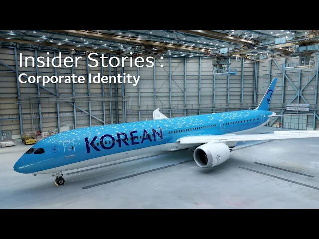
The most impressive aspect of this airline rebranding isn't any single design element — it's the remarkable cohesiveness across every touchpoint in the customer journey. From aircraft livery to cabin interiors, website UI to digital Skypass design, every element works in harmony.
This is exactly where many rebranding projects stumble. They create beautiful assets that never get properly implemented, or they implement inconsistently across channels. Korean Air shows why thorough execution creates massive value for marketing moving forward.
The Takeaway for Your Brand
Visual systems aren't just decoration — they're how your audience understands who you are before you say a word. Whether you're considering refreshing your logo or a complete rebrand, remember that your visual identity communicates your core values and positioning in ways words simply can't.
The key lessons from Korean Air's success apply to businesses of any size:
Honor your heritage while embracing thoughtful evolution
Ensure your visual system works across all digital and physical contexts
Maintain cohesive implementation across every customer touchpoint
Create visual elements that actually communicate your brand values
Need Help With Your Own Rebrand?
If you're thinking about refreshing your own brand's visual identity, you don't need an airline's budget to get professional results. Our design subscription at DesignBff covers everything your rebrand might require — from logo redesigns and identity systems to website UI/UX updates, print materials, and every touchpoint where your brand connects with customers.
Having a consistent design partner means your brand evolution will maintain that cohesiveness that makes rebrands like Korean Air's so successful. Let's talk about how we can simplify your rebranding process while delivering results that elevate how people perceive your business. Book your consultation today.
Credit: